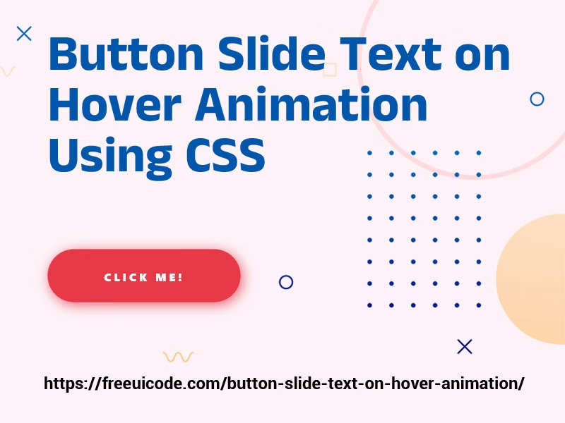
Adding subtle hover animations to your website can instantly make it look more interactive and modern. One popular effect is the slide text on hover animation, where the text smoothly slides in or out when a user hovers over it.

In this tutorial, we’ll show you exactly how to create this effect using only HTML and CSS, no JavaScript required. You’ll get:
Button Slide Text on Hover Animation Demo
Step 1: Basic HTML Structure
<button data-hover="click me!"><div>Hover me!</div></button>Step 2: Add the CSS for Slide Text Animation
button {
  background: transparent;
  outline: none;
  position: relative;
  border: 0px solid #111;
  padding: 15px 50px;
  overflow: hidden;
  background-color: #111;
  border-radius: 30px;
  transition: background-color 0.3s ease-in-out
}

button:hover {
  cursor: pointer;
  background-color: #e63946;
}

button:hover:before {
  opacity: 1;
  transform: translate(0, 0);
}

button:before {
  content: attr(data-hover);
  position: absolute;
  top: 1.1em;
  left: 0;
  width: 100%;
  text-transform: uppercase;
  letter-spacing: 3px;
  font-weight: 800;
  font-size: 0.8em;
  opacity: 0;
  transform: translate(-100%, 0);
  transition: all 0.3s ease-in-out;
  color: #fff;
}

button:hover div {
  opacity: 0;
  transform: translate(100%, 0);
}

button div {
  text-transform: uppercase;
  letter-spacing: 3px;
  font-weight: 800;
  font-size: 0.8em;
  transition: all 0.3s ease-in-out;
  color: #fff;
}Live Preview
You can see a live demo of this animation on our Button Hover Effects
That’s it! You’ve successfully created a slide text on hover animation using CSS.
This effect is lightweight, doesn’t require JavaScript, and works in all modern browsers. Perfect for adding a stylish interactive feel to your website’s UI.
If you liked this tutorial, check out more CSS animations and UI code snippets in our Website
Click Here to Read – Multilevel Navigation Menu Script – Build Responsive, Mobile-Friendly Dropdown Menus Easily
Follow us on Twitter


