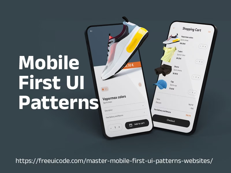
In today’s digital landscape, mobile-first design is no longer optional – it’s essential. With the majority of web traffic originating from mobile devices, prioritizing the mobile experience is crucial for user satisfaction, SEO rankings, and overall business success. This article dives into the best mobile-first UI patterns, providing practical guidance and examples to help you create websites that deliver seamless and engaging experiences on any screen size.

Table of Contents
Why Mobile-First UI Patterns Matter
Mobile-first design isn’t just about shrinking a desktop website to fit a smaller screen. It’s a fundamental shift in thinking that involves designing for the constraints and opportunities of mobile devices first. This approach offers several significant advantages:
- Improved User Experience: Mobile-first forces you to prioritize essential content and features, resulting in a cleaner, more focused user experience.
- Enhanced Performance: By designing for the limited resources of mobile devices, you naturally optimize your website for speed and efficiency.
- Better SEO: Google prioritizes mobile-friendly websites in its search rankings. Mobile-first design ensures your site meets these criteria.
- Increased Accessibility: Focusing on simplicity and clear navigation improves accessibility for users with disabilities.
- Future-Proofing: As mobile technology continues to evolve, a mobile-first foundation ensures your website remains adaptable and relevant.
Top Mobile-First UI Patterns
Let’s explore some of the most effective Mobile-First UI Patterns for creating outstanding mobile-first websites:
1. Hamburger Menus
The hamburger menu (three horizontal lines) is a ubiquitous icon used to collapse navigation options into a hidden panel, freeing up valuable screen real estate. While often criticized, it remains a practical solution for complex navigation on mobile devices.
- Best Practices:
- Use a recognizable hamburger icon.
- Ensure the menu is easily accessible with a large touch target.
- Animate the menu transition for a smooth user experience.
- Consider alternative navigation patterns (discussed below) if your navigation is simple enough.
2. Bottom Navigation Bars
Bottom navigation bars provide quick access to frequently used features. They are particularly effective for apps and websites with a limited number of primary navigation options (typically 3-5).
- Best Practices:
- Use clear and recognizable icons with labels.
- Highlight the currently active item.
- Keep the number of items manageable to avoid overcrowding.
- Consider the “thumb zone” – ensure items are easily reachable with a thumb.
3. Fullscreen Takeovers
Fullscreen takeovers temporarily overlay the entire screen to display important information, such as promotional offers, notifications, or onboarding sequences. They should be used sparingly to avoid disrupting the user’s flow.
- Best Practices:
- Use them sparingly and only for critical information.
- Provide a clear and easy-to-find close button.
- Ensure the content is visually appealing and engaging.
- Optimize loading speed to minimize user frustration.
4. Accordions and Expandable Sections
Accordions and expandable sections allow you to collapse large amounts of content into manageable chunks. Users can then expand the sections they are interested in, creating a cleaner and more organized layout.
- Best Practices:
- Use clear headings to indicate the content within each section.
- Provide visual cues (e.g., plus/minus icons) to indicate expandability.
- Ensure smooth and responsive animations for expanding and collapsing.
- Consider using icons relevant to the content within the accordion.
5. Cards
Cards are versatile UI elements that can be used to display various types of content, such as articles, products, or user profiles. They provide a visually appealing and organized way to present information in a concise and digestible format.
- Best Practices:
- Use consistent card sizes and layouts.
- Include a clear visual hierarchy with a headline, image, and brief description.
- Use appropriate whitespace to prevent overcrowding.
- Make cards interactive by adding buttons or links.
6. Simplified Forms
Forms are notoriously challenging on mobile devices. Streamlining the form-filling process is crucial for improving conversion rates. Use techniques like:
- Best Practices:
- Minimize the number of fields required.
- Use appropriate input types (e.g., email, number, date).
- Provide clear and concise labels.
- Use auto-complete and auto-suggestion features.
- Offer inline validation and error messages.
7. Infinite Scrolling
Infinite scrolling allows users to continuously load content as they scroll down the page, providing a seamless and engaging browsing experience. However, it’s important to use it judiciously, as it can negatively impact performance and accessibility.
- Best Practices:
- Ensure content loads quickly and smoothly.
- Provide a “load more” button as an alternative to infinite scrolling.
- Consider adding a back-to-top button.
- Avoid infinite scrolling on pages with important footer content.
Comparison of Top Mobile-First UI Patterns
| UI Pattern | Pros | Cons | Best Use Cases |
|---|---|---|---|
| Hamburger Menu | Conserves screen space, organizes complex navigation. | Can be less discoverable, requires an extra click. | Websites with many navigation options. |
| Bottom Navigation Bar | Easy access to key features, good thumb zone placement. | Limited number of options, not suitable for complex navigation. | Apps and websites with 3-5 primary functions. |
| Fullscreen Takeover | Captures user attention, effective for important announcements. | Can be intrusive, disruptive to user flow if overused. | Promotional offers, critical notifications. |
| Accordions | Organizes large amounts of content, improves readability. | Can require multiple clicks to find desired information. | FAQs, product descriptions, detailed articles. |
| Cards | Visually appealing, versatile, can display various content types. | Requires careful layout and design to avoid clutter. | News feeds, product listings, user profiles. |
Key Considerations for Mobile-First UI Patterns Implementation
Beyond selecting the right UI patterns, successful mobile-first implementation requires careful planning and execution. Consider the following factors:
- Responsive Design: Ensure your website adapts seamlessly to different screen sizes and orientations using responsive design techniques.
- Performance Optimization: Optimize images, minimize HTTP requests, and leverage browser caching to improve loading speed.
- Touch-Friendly Interactions: Design for touch input by providing ample touch targets and intuitive gestures.
- Accessibility: Adhere to accessibility guidelines (WCAG) to ensure your website is usable by people with disabilities.
- Testing: Thoroughly test your website on various mobile devices and browsers to identify and resolve any issues.
FAQ: Mobile-First UI Patterns
What is mobile-first design?
Mobile-first design is a design philosophy where you prioritize the mobile experience when designing a website or app. You start by designing for the smallest screen size and then progressively enhance the design for larger screens.
Why is mobile-first design important?
It’s important because most web traffic comes from mobile devices. Mobile-first design improves user experience, boosts SEO, and ensures accessibility.
What are some common mobile-first UI patterns?
Common patterns include hamburger menus, bottom navigation bars, accordions, cards, and simplified forms.
How do I choose the right UI patterns for my mobile website?
Consider your content, target audience, and the overall goals of your website. Choose patterns that are appropriate for the context and that enhance the user experience.
How do I test my mobile-first design?
Test your website on a variety of mobile devices and browsers. Use tools like browser developer tools, emulators, and real device testing platforms.
Follow us on Twitter
Free CSS Button Generator – Design & Preview Custom Buttons Online


