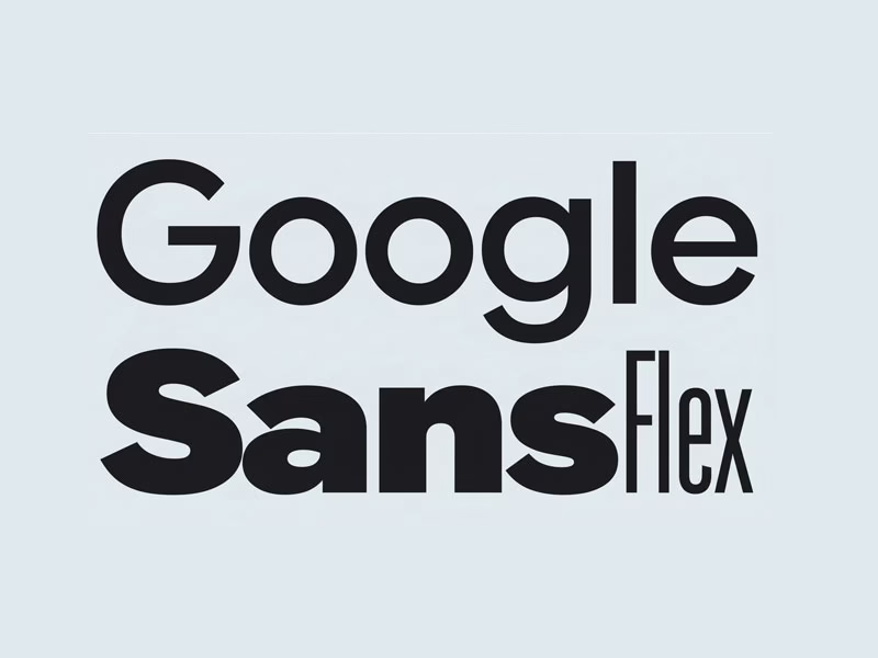
Welcome to the future of digital typography. In the fast-evolving landscape of web and UI/UX design, finding a typeface that offers both aesthetic appeal and unparalleled flexibility is paramount. Enter Google Sans Flex, a groundbreaking variable font poised to redefine how designers approach responsive layouts and brand consistency. This comprehensive guide will delve deep into the capabilities of Google Sans Flex, offering insights for web designers, UI/UX professionals, and frontend developers aiming to elevate their digital experiences.

Variable fonts represent a significant leap forward from traditional static typefaces, allowing for a single font file to contain an infinite range of styles. This innovation directly addresses the complexities of modern multi-device environments, where content must adapt seamlessly across countless screen sizes and resolutions. By embracing the power of Google variable font technology, designers can achieve unparalleled control over typography, enhancing readability, accessibility, and overall user engagement.
Understanding Google Sans Flex font is no longer optional; it’s a strategic advantage. As an expert in UI/UX design, web typographer, and SEO content strategist, I’ll walk you through everything from its core features and implementation to its profound impact on performance and branding. Prepare to unlock the full potential of this modern UI font by Google and transform your digital projects with truly flexible typography.
Table of Contents
What Is Google Sans Flex?
Google Sans Flex is Google’s sophisticated take on a variable font, designed to offer an extensive spectrum of typographic possibilities within a single, optimized file. It’s an evolution from its predecessor, Google Sans, inheriting its clean, geometric aesthetic while adding dynamic control over various font axes. This innovation allows designers to fine-tune typography with unprecedented precision, moving beyond the limitations of predefined styles.
The primary motivation behind Google’s introduction of Google Sans Flex stems from the growing demands of responsive design and the need for highly adaptable typefaces. In an era where users access content on devices ranging from smartwatches to large desktop monitors, a static font with limited weights and styles simply falls short. Google Sans Flex was engineered to provide a robust solution, enabling consistent visual branding and optimal readability across any digital canvas.
At its core, Google Sans Flex embodies the principles of modern UI design: adaptability, efficiency, and user-centricity. By integrating this advanced Google variable font into projects, designers can craft interfaces that not only look polished but also perform exceptionally well. It represents Google’s continued commitment to pushing the boundaries of web typography, making sophisticated design tools accessible to the broader developer and design community.
Key Features of Google Sans Flex
The defining characteristic of Google Sans Flex is its harnessing of variable font technology, which allows for continuous adjustments along specific design axes. Unlike traditional fonts that require a separate file for each weight (e.g., Light, Regular, Bold), Google Sans Flex packs this entire range, and more, into one efficient package. This technological advancement significantly reduces the overhead associated with loading multiple font files, streamlining web performance.
Google Sans Flex offers remarkable flexibility across several key axes, including width, weight, and optical size (opsz). The wght axis allows for a spectrum of thickness, from ultra-thin to super-bold, providing granular control over the font’s appearance. The wdth axis enables adjustments to the character width, letting designers condense or expand text to fit specific layouts without distorting letterforms. Furthermore, the opsz (optical size) axis is crucial for maintaining optimal readability at different text sizes, subtly adjusting character details to appear balanced whether used in a tiny caption or a large headline.
These dynamic axes translate directly into tangible performance and responsiveness benefits for web projects. By serving a single, intelligently designed variable font file, websites can significantly reduce load times and HTTP requests, contributing to a snappier user experience. This inherent adaptability also means that typography can fluidly adjust to different screen sizes and user preferences, ensuring an optimal visual presentation and consistent brand voice across all devices and resolutions.
Google Sans vs Google Sans Flex
Understanding the distinction between Google Sans and Google Sans Flex is crucial for making informed design decisions. Google Sans, while aesthetically pleasing and widely used in Google’s own products, is a collection of static font files, each representing a fixed weight or style (e.g., Google Sans Regular, Google Sans Bold). This means if you need a light, regular, and bold version, you’d typically load three separate font files, each with its own specific characteristics.
Google Sans Flex, on the other hand, is a variable font. This fundamental difference means it encapsulates an entire range of styles—weights, widths, and optical sizes—within a single font file. Instead of choosing from predefined static instances, designers can continuously interpolate between these axes, creating an infinite number of intermediate styles. This offers unprecedented control and precision, allowing for micro-adjustments that static fonts simply cannot provide.
The choice between them largely depends on your project’s specific needs. For straightforward applications where a consistent, fixed set of weights is sufficient and file size is less of a concern, static Google Sans might still be a viable option, especially if you prioritize absolute consistency over dynamic responsiveness. However, for modern web applications, intricate UI designs, and projects demanding adaptive typography, precise control, and optimized performance, Google Sans Flex is the clear winner. It empowers designers to build truly responsive and future-proof interfaces, making it the preferred choice for forward-thinking web and UI/UX professionals.
Why Designers Love Google Sans Flex
Designers are rapidly embracing Google Sans Flex for its profound UI/UX advantages, which empower them to craft interfaces with greater precision and fluidity. The ability to fine-tune typography across multiple axes—weight, width, and optical size—means that text can be perfectly optimized for every context, from dense data tables to prominent hero headlines. This granular control ensures that every piece of text contributes to a cohesive and intuitive user experience, enhancing readability and visual hierarchy.
Beyond aesthetics, Google Sans Flex significantly boosts accessibility and readability, critical factors for inclusive design. The optical size axis (opsz) is particularly valuable here, allowing the font to dynamically adjust its form to remain legible at very small or very large sizes, preventing the common pitfalls of distorted or hard-to-read text. This adaptability ensures that content is accessible to a broader audience, regardless of their visual needs or device settings.
Ultimately, Google Sans Flex fosters unparalleled consistency across devices and platforms. By utilizing a single variable font file, designers can guarantee that their brand’s typographic voice remains uniform, whether viewed on a mobile phone, tablet, or desktop. This consistency not only strengthens brand identity but also reduces cognitive load for users, creating a more professional and seamless interaction. It’s a powerful tool for maintaining a unified visual language throughout an entire digital ecosystem.
How to Use Google Sans Flex in Web Projects
Integrating Google Sans Flex CSS into your web projects is a straightforward process, typically involving @import rules or self-hosting via @font-face. For convenience, you can often source variable fonts directly from Google Fonts, which provides the necessary CSS link. Once imported, you declare the font family, just as you would with any other font, but the real power comes in manipulating its variable axes using the font-variation-settings CSS property.
/* Example: Importing Google Sans Flex from Google Fonts */
@import url('https://fonts.googleapis.com/css2?family=Google+Sans+Flex:wght@100..900&display=swap');

body {
  font-family: 'Google Sans Flex', sans-serif;
  font-weight: 400; /* Default weight */
}

/* Example: Using font-variation-settings */
h1 {
  font-family: 'Google Sans Flex', sans-serif;
  font-variation-settings: 'wght' 700, 'wdth' 100, 'opsz' 36; /* Bold, normal width, opt. size 36 */
}

.caption {
  font-family: 'Google Sans Flex', sans-serif;
  font-variation-settings: 'wght' 200, 'wdth' 80, 'opsz' 12; /* Light, condensed, opt. size 12 */
}
The font-variation-settings property is where the magic happens, allowing you to control the variable font axes. As explained earlier, 'wght' controls the weight (e.g., 100 for thin, 900 for black), 'wdth' manages the width (e.g., 80 for condensed, 120 for expanded), and 'opsz' adjusts the optical size (e.g., 12 for small text, 72 for large headlines). These values are continuous, meaning you can pick any number within the defined range for each axis, offering incredibly precise typographic control.
For responsive typography, Google Sans Flex truly shines. You can leverage media queries to dynamically adjust font settings based on screen size, ensuring optimal readability and aesthetic appeal across all devices. For instance, you might use a condensed width (wdth) for smaller screens to save space, and a wider, more relaxed width for larger displays. This approach ensures that your typography is always perfectly tailored to the viewing environment, a cornerstone of modern web design best practices (explore more responsive typography tips).
Google Sans Flex for UI Design & Branding
Google Sans Flex is an invaluable asset for UI design across a multitude of applications, from complex dashboards to intuitive mobile apps and robust SaaS platforms. Its ability to offer a vast range of styles from a single file means designers can maintain a consistent visual language even with diverse typographic needs. Imagine crafting a dashboard where numeric data requires a slightly condensed, medium weight for clarity, while accompanying labels benefit from a lighter, regular width—all achievable with a single font and precise CSS adjustments.
The font’s inherent flexibility makes it exceptionally compatible with design systems like Material Design, which emphasizes adaptable and responsive components. Google Sans Flex can be the foundational typeface that scales effortlessly across different Material Design elements, ensuring a harmonious and unified aesthetic. This adaptability is critical for large-scale projects where maintaining brand consistency across numerous UI elements and components can be a significant challenge.
For branding, Google Sans Flex offers a unique opportunity to define a dynamic yet consistent visual identity. Instead of being limited to a few static weights, brands can use the variable axes to create subtle yet impactful variations in their typography, adapting to different marketing materials or user touchpoints. This level of control allows for a sophisticated brand expression that is both modern and highly adaptable, strengthening recognition and reinforcing a polished brand image across all digital mediums.
Performance & SEO Benefits of Variable Fonts
One of the most compelling advantages of adopting variable fonts like Google Sans Flex is the significant boost in performance they offer. Traditional web design often involves loading multiple static font files for different weights and styles, leading to numerous HTTP requests and increased overall file size. Google Sans Flex, by consolidating all these styles into a single, highly optimized file, drastically reduces the number of font files required, leading to fewer network requests and a smaller total font payload.
This reduction in file size and HTTP requests directly translates to faster page load times, a critical factor for both user experience and search engine optimization. Websites that load quickly tend to have lower bounce rates and higher engagement, which Google’s algorithms favor. Utilizing variable fonts contributes positively to key performance metrics, ensuring your site is nimble and responsive, even on slower connections.
The impact of faster page loads extends directly to Core Web Vitals, Google’s set of metrics for measuring user experience. A smaller font payload helps improve Largest Contentful Paint (LCP), as the primary content (often text) can render sooner. It also minimizes Cumulative Layout Shift (CLS) by ensuring that font loading doesn’t cause unexpected layout shifts, as the browser only needs to fetch and process one comprehensive font file. By embracing Google fonts variable font technology, you’re actively optimizing for SEO and providing a superior user experience (learn more about Core Web Vitals).
Is Google Sans Flex Free to Use?
A common and important question for designers and developers is the licensing status of Google Sans Flex. Yes, Google Sans Flex, like many of Google’s other typefaces, is generally available for free under an open-source license. This means you can use it for both personal and commercial projects without incurring licensing fees. This accessibility is a significant advantage, making high-quality, flexible typography available to everyone.
For seamless integration, Google Sans Flex is indeed available through Google Fonts, Google’s extensive library of open-source typefaces. This platform simplifies the process of embedding the font into your web projects, providing convenient @import CSS links and detailed usage instructions. The Google Fonts service handles the hosting and delivery, ensuring optimal performance and compatibility across various browsers and devices.
The availability of Google Sans Flex on Google Fonts further solidifies its position as a go-to choice for modern UI and web design. Its open-source nature removes financial barriers, allowing designers and developers of all scales to leverage its advanced features. This commitment to accessibility aligns perfectly with Google’s broader mission to foster innovation and provide powerful tools to the global design community, making it an excellent choice for any project (check Google Fonts for the latest availability and embed codes).
Best Alternatives to Google Sans Flex
While Google Sans Flex offers exceptional versatility, exploring alternatives can broaden your typographic toolkit and help you find the perfect fit for specific project needs. One prominent contender is Inter, a highly popular variable font designed by Rasmus Andersson, specifically optimized for user interfaces. Inter boasts an extensive range of weights and numerous OpenType features, making it incredibly versatile for UI design, often providing excellent readability even at small sizes.
Another strong alternative from Google’s own stable is Roboto Flex. As the variable version of the widely adopted Roboto, it offers similar levels of flexibility to Google Sans Flex, with comprehensive control over weight, width, optical size, and even grade (fineness of strokes). Roboto Flex maintains the familiar, neutral aesthetic of Roboto, making it a safe and highly adaptable choice for projects requiring a clean, functional typeface that can scale dynamically.
For designers working within the Apple ecosystem, SF Pro (San Francisco Pro) is a compelling, albeit proprietary, alternative. While not a variable font in the same way as Google Sans Flex or Roboto Flex, SF Pro is Apple’s system font, meticulously designed for optimal legibility across its devices. It includes optical sizes (SF Pro Display and SF Pro Text) that automatically adjust based on font size, providing a similar effect to the opsz axis. While not directly comparable in its variable font technology, its system-level integration and careful design make it a strong alternative for native app UI.
Frequently Asked Questions (FAQ)
What is Google Sans Flex used for?
Google Sans Flex is primarily used for modern UI/UX design and web development, where its variable font capabilities allow for precise typographic control and highly responsive layouts. It’s ideal for dashboards, mobile applications, SaaS platforms, branding, and any digital interface that requires adaptive and consistent typography across various screen sizes and resolutions.
Is Google Sans Flex available on Google Fonts?
Yes, Google Sans Flex is available on Google Fonts. This makes it easy for designers and developers to integrate the font into their projects using simple @import CSS rules, benefiting from Google’s reliable hosting and delivery infrastructure. The platform provides all the necessary code snippets and customization options.
Can I use Google Sans Flex for commercial projects?
Absolutely. Google Sans Flex is released under an open-source license, typically the SIL Open Font License, which permits its free use for both personal and commercial projects. This means you can confidently incorporate it into your professional work, client projects, and commercial products without worrying about licensing fees or restrictions.
As we’ve explored, Google Sans Flex stands out as a transformative tool in the modern designer’s arsenal. Its powerful variable font technology offers an unparalleled degree of control over typography, enabling pixel-perfect adjustments that static fonts simply cannot match. From enhancing accessibility and readability to ensuring brand consistency across diverse platforms, the advantages are clear and compelling.
Beyond its aesthetic and functional benefits, Google Sans Flex delivers significant performance gains. By streamlining font delivery and reducing file sizes, it contributes directly to faster page loads and improved Core Web Vitals, making your digital products not just beautiful, but also highly performant and SEO-friendly. This combination of design prowess and technical efficiency firmly establishes it as a future-ready solution for web and UI/UX typography.
Embracing Google Sans Flex is more than just choosing a font; it’s adopting a philosophy of adaptable, efficient, and user-centric design. For any web designer, UI/UX professional, or frontend developer looking to stay ahead of the curve, mastering this modern UI font by Google is an essential step towards crafting truly exceptional digital experiences. Its flexibility, performance, and open-source nature make it an indispensable asset in the evolving landscape of digital design.
Follow us on Twitter
Amazing CSS Transform & Translate Generator – Create Stunning Effects Easily


